This Is Why Web Design and UI Matter for SEO in 2020
This article is a guest contribution – read more about the author at the bottom of the post.
A long time ago, in a galaxy far, far away…. web design and SEO used to be incredibly different departments, processes, and work-flows.
Okay, maybe not that long ago and not in a galaxy far, far away, but now more than ever, SEO is becoming an integral part of web design and vice versa.
Google Search Console now throws errors for elements of design and has even partnered up with https://material.io/ to help guide and influence your design.
I kid you not! Take a look at the footer of Material.io, and you’ll see Google’s logo.
Crazy, right?
Well, once you begin to consider the holistic ideology of a website seriously, it all starts to make more sense.
After all, the whole point of most websites is to solve a problem or answer a question.
If you can’t — or won’t — do it in a way that users enjoy visually, why would they stick around or come back?
That said, let’s jump right in to discuss the top three ways design and user interface can help improve SEO:
Color, Contrast, and Whitespace
Readability, Typography, Tone, and Direction
Headings, Underlines, and Bolded Text
Color, Contrast, and Whitespace
It’s never been truer, especially in marketing, that color has a power which directly influences decision making — and it looks like Google knows it, too.
As the evolution of user interface and SEO progresses, color, contrast, and whitespace are becoming crucial for a multitude of reasons.
Anecdotally speaking — outside of ADA standards for accessible design and Google’s known contrast requirements — have you noticed the flat-minimalistic trend?
How websites utilizing two or three flat pastel colors and one conversion shade with a ton of whitespace often skyrocket to position 0 and 1 in the SERPs?
I certainly have!
I know at this point, you might be thinking this is all a bunch of utter nonsense.
Your closest friend — who is an SEO guru — told you that design doesn’t impact your SERP ranking, right?
Well…
When digging through the Material.io guidelines, I found a study about how Google has used whitespace to convey trust and authority — and if they’re judging themselves based on this secondary signal, they may well be judging you.
Read here how Google created a custom Material theme with an emphasis on whitespace, because they found it consistently conveyed a sense of security to site visitors in surveys and tests.
It’s also important to note is that many major brands have moved to flat color combinations featuring high-contrast design and macro use of whitespace.
Think Uber, Lyft, Snapchat, Instagram, Facebook, and… Google & Google’s tools.
Coincidence?
Let’s play devil’s advocate for a moment and assume Google isn’t evaluating your website based on attributes such as whitespace, flat pastel colors, and contrast.
Does this mean you shouldn’t employ these concepts strategically and base your site’s design solely on what you think “looks best?”
Research says no.
I won’t dig too deep here. This article intends to persuade you to use UI/UX Google likes, not give you an art lesson.
But here are some additional resources to provide further insight into the use of color, contrast, and whitespace.
Color in Design:
Article I – Understanding Color Psychology
Contrast:
Article I – Color Psychology and Contrasts
Psychology of Whitespace:
Article I – Whitespace & Web Design
Article II – Psychology of Web Design
Readability, Typography, Tone, and Direction
I’m going to warn you right now: the following viewpoint is highly controversial in SEO circles.
So controversial that you may decide I’ve no clue what I’m talking about, and SEOButler should fire me as a contributor and denounce all my previous articles.
Okay, maybe that’s a bit overdramatic, but you get my point.
To make my case, I’ll cite Google documentation and screenshots so we can discuss the points I espouse using the most authoritative sources available.
Let’s jump right in.
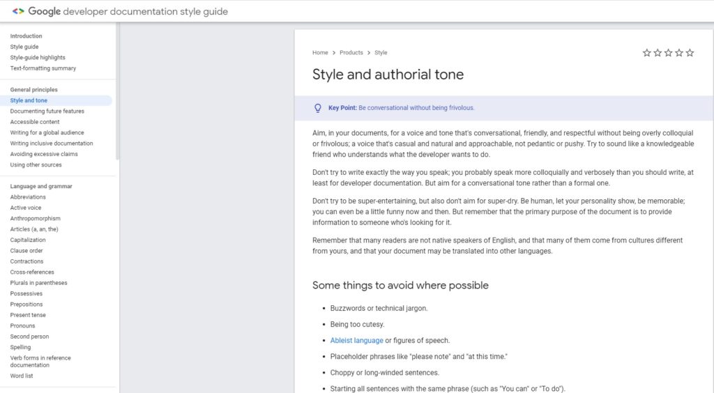
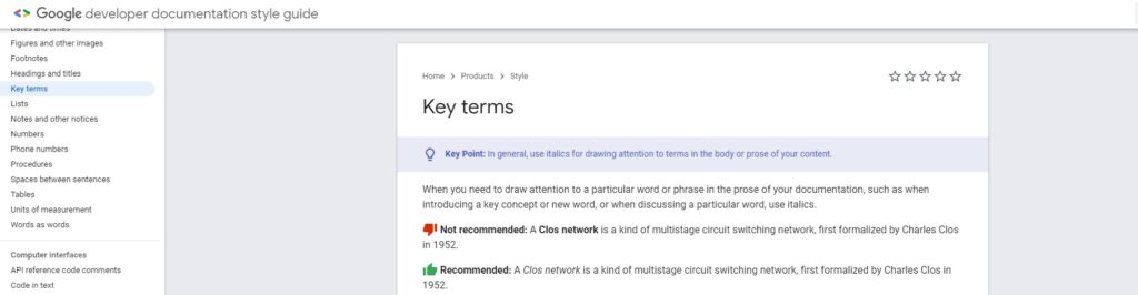
Check out the screenshot below. It’s from the Google developer documentation and style guide.
That’s right — straight from Google.
Let’s start with readability, typography, and tone.
As we can see from this document, Google wants us to adopt a “conversational tone,” as if we were a knowledgeable friend.
Am I doing alright so far? 😉
The document goes on to state that your writing tone should be authoritative, approachable, and above all else — human.
Note: For some niches like medical and YMYL, this may not always apply, but informal blogs and articles should aim for a conversational tone.
Let’s take a minute to observe a few other things that pertain to how Google has decided to format their own material (not technically related to SEO):
- There’s a bulleted list for individuals who prefer to skim articles rather than read them fully (see what I did there?)
- The letter kerning is standard for most font sizes but has a slightly wider than usual word spacing, creating additional whitespace.
- In most cases, paragraph length never exceeds three sentences.
- The grammar is impeccable.
- Word selection and conventions are not overly difficult.
These are just a few observations. I’m sure you could make even more if you took the time.
One thing I want to discuss in greater detail about this particular Google page is direction.
In this instance, direction refers to the path the reader’s eyes follow as they scan the page.
Direction is a crucial factor when it comes to bounce rate, pogo-sticking, and, most of all, providing the user with a timely solution to their query.
So, how is Google influencing direction within their own content?
Let’s reassess the image below.
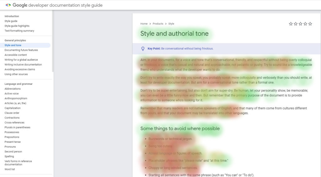
Google has done something incredibly important here to help keep users engaged. Did you notice it before getting this far?
They have formatted the content to match how humans read, scan, and track web pages.
How, you ask?
- The F-Shape — Generally speaking, people read and scan screens in the shape of an “F.” On a macro level, Google has made sure their documentation matches this behavior.
- The F-Shape Reinforced — Not only is the entire article F-shaped on a macro level, but it’s also F-shaped on a micro-level. Take note of the sentence structure in the first four sections. Notice anything? Google has alternated between three lines, to two lines, back to three lines, and then two lines — reinforcing the F-shape.
Note: If they wanted to reinforce the F shape further, Google could’ve put their longest bullet points first and the shorter ones in descending order.
I hope all you CRO specialists are taking note!
What else do you notice about the direction of the text, if anything?
Maybe the breadcrumb navigation at the top of the page?
Or the key point and actionable take away for those low on time?
How about the fact there’s only one h1, and the smaller sub-headings are h2’s?
While technically a facet of semantic on-page SEO best practices, the headings highlight areas of interest for users, improving the direction.
Did you also notice the table of contents on the sidebar with jump links designed to help users find answers to their query more quickly?
Note: Since we’re talking about jump links: When done correctly, Google has lately been featuring jump links in their SERPs. Also, note that jump links with query answers usually obtain position 0.
Headings, Underlines, and Bolded Text
If you’re a technical SEO, I’ll bet you either consciously or subconsciously believe that headings, underlined words, and bolded text are critical semantic on-page SEO factors.
And you’re right, they are…
But that’s not why they were created, nor should it be the main purpose of their use.
Allow me to explain.
Headings
Headings are directional cues for people.
Yes, people — not just search engines.
Headings have been helping people find relevant information since long before the invention of the internet (think newspapers).
Design largely dictates the directional flow of users and how they experience and absorb information from websites.
Headings help break that experience up into critical segments of particular interest — especially when there’s a lot of text on the page (like with this article, for example).
When you use headings for their original intended purpose rather than as an SEO tactic, both you and the user win. You get to style your page semantically, and the user can quickly ascertain what information is valuable to them.
The question remains: do search engines look at headings only from a contextual standpoint? Or do they also examine what is above, below, and around them?
John Mueller of Google explains it like this:
“[ ]What we use these headings for is, well, we have this big chunk of text, or we have this big image, and there’s a heading above that, therefore maybe this heading applies to this chunk of text or to this image.
So it’s not so much like there are five keywords in these headings, therefore this page will rank for these keywords, but more, here’s some more information about that piece of text or about that image on that page.
And that helps us to better understand how to kind of frame that piece of text, how to frame the images that you have within those blocks. And with that, it’s a lot easier to find… the right queries that lead us to these pages.”
When you read the above excerpt, you may begin to paint a new picture for yourself when it comes to headings.
You can see that while headings can help with semantic principles of SEO, the critical part is to quickly guide users to the information you believe their query seeks.
After all, it’s like I tell my SEO’s at our local firm:
“Don’t use headers for keywords — use headers to help people understand the context of your topics.”
Easy enough, right?
Underlines or Colors In Hyperlinks
For years, there’s been debate in SEO circles regarding underlining hyperlinks, the colors of the hyperlinks themselves, and whether hyperlinks even have any impact on rankings.
There once even a point in internet history when the only style that could be attributed to a hyperlink was an underline.
But how does that still apply, and is it relevant?
Remember, you’re creating a website for your user, not just to rank higher in the SERPs.
If we head over to Google and start rummaging through their documentation, we may notice a few things that point towards an answer.
What are they?
- Google has moved away from underlining their hyperlinks. Until a year or two ago, all Google documentation had underlines visible to the reader.
- Google is still using the same color blue as always to represent a hyperlink.
- Google is using underlines on hover in the SERP for hyperlinks and on much of their documentation.
So what’s the takeaway?
Put yourself in the shoes of your audience and let that inform what you do.
If you land on a website with information you’re interested in reading and you want to click through a hyperlink, would you be more inclined to Click Here or to Click Here?
In our various studies, we’ve concluded that people are more likely to click the bolded, hyperlinked text over the former.
Why?
Because color is often used to attract and emphasize key points, but that does not necessarily convey the ability to read further by clicking on a link.
So, what does Google want?
In my opinion, Google only cares about consistency and making it crystal clear to your reader what can be clicked and what can’t.
What this means is — whether you decide to use this, or to use this — make sure you’re encouraging directional flow and using uniform conventions to direct your reader.
Note: In case studies, Google determined that using a blue hue with a contrast ratio of 4:1 for hyperlinks is best practice.
You can read more about hyperlinking conventions on Web Fx, a leading resource.
As to how this pertains to SEO, we now know that hyperlinks play an integral role in helping Google understand what pages are about — especially when related to an interlinking structure.
Because Google’s bots do not read color or underlines, there is no direct correlation to SEO from a primary ranking perspective. However, as a secondary consideration, if users don’t understand your hyperlinking conventions or are less likely to click them, you will see a drop in page pass-throughs and dwell time.
Bolded Text or Italics
When it comes to bolded and italic text formatting and SEO, any specialist worth their salt has tested their theories in the SERPS — especially as it pertains to design and indexability for emphasized context.
But what does Google say about bolds and italics, and how does the user experience relate back to SEO?
Let’s get it straight from the horse’s mouth.
In the image below, Google tells us exactly what it wants and has even given us an example of it. I bet they’ve done their research too!
Fascinating, isn’t it?
Note: While most people use <i> to italicize their text, there is a better way to do it.
How, you ask?
By using the <em> tag. The <em> tag was created to draw emphasis to a particular part of the text and can be styled with CSS.
Let’s test this theory. At the time of writing, Google hasn’t indexed this article.
I’m going to emphasize a piece of text below with the <em> tag and see how Google later pulls it into the SERPS.
<em style=”font-style: italic;”>Schieler Mew Has Written this Article On SEO Butler</em>
Prediction: Later, when Googling this exact phrase, I anticipate Google pulling it into the SERP bolded for this article. Let’s see what happens!
As it pertains to user direction and flow, we can draw this conclusion: Italics draw attention, as it’s a different style of formatting that’s used adjacent to expected formatting styles.
The reader will be naturally drawn to it, especially if Google is emphasizing bolds and italics in the SERPS, which is to be expected.
Final Thoughts on Web Design and UI and How It Affects SEO
Taking into consideration all of the points above from a design and UI perspective, you can begin to see how all of it ties into SEO.
While some of the claims here are inferred and correlative, I’ve gone directly to the source: I’ve looked at what Google is doing and how they do it.
While nothing in design or SEO is definitive, one principle seems clear — creating a seamless and satisfying experience for your users should be priority #1 in 2020.
There’s little doubt that Google is steering its algorithms to better understand how humans process information in order to provide more relevant results for search queries.
While it can be argued that design and UI are not yet a significant ranking factor in SEO, all signs point to them being ever more crucial going forward.
I will leave you with one last thought, my friends.
Perform SEO today, with the future in mind!
[cta]
[author_bio image=”https://seobutler.com/wp-content/uploads/2019/07/Schieler-Mew-Headshot-Cropped-150×150.png” name=”SCHIELER MEW”]Schieler Mew is a Digital Marketing Strategist and Comprehensive SEO consultant that has worked with Fortune 500 companies all the way down to local SMB’s. He specializes in advanced SEO theory and technical concepts to help online businesses thrive in evolving and volatile markets. Schieler is the owner of Viictory Media[/author_bio]
10 thoughts on “This Is Why Web Design and UI Matter for SEO in 2020”
Leave a Reply
You must be logged in to post a comment.
This is an incredibly well written article and something every SEO should be paying attention to.
Schieler, the author has hit the nail on the head with his assertions and the connections made in this piece. While other SEOs fail to realize what is outlined above and focus on authority signals only, they are missing the entire point of a website and why search engines send people to them.
Ease of use, accessibility, and a way to quickly solve the issue. Design is what makes this easy for a user, SEO is what makes it easy for crawlers. You need both with the former first.
Great share. This should be on every marketer’s radar for 2020 and beyond.
I really think you make some valid points here. I’m going to test these out on some of my sites and see how it work. Thanks for the tips!
Very interesting read, thank’s for the tips i’ll be trying these out. Makes a lot of sense for google to make everyone consider the user interface to be a very important part of SEO now. I’m assuming it’ll become more and more important as we get into 2020.
First of all, let me say – great article!
I always enjoy seeing another Schieler post come up on our site.
What fascinates me with this one is that there still seems to be a confusion in many peoples’s minds between CRO and Usable Design /UX.
CRO has become vastly popular in the last couple of years thanks to great tools such as HotJar and VWO, and companies like Convertica.
But many SEOs seem to be looking at CRO to make their design more user-friendly.
So many CRO businesses are forced into helping customers with design, rather than analysing stats and eliminating inhibitors to conversion.
Most of the time, this results in design changes such as button colours or bolded text, items that influence both the UX and UI.
But there are two points I’d like to make regarding this.
1. Usable design should come first. CRO should come second.
When striving to make your design user-friendly, mouse movement heatmaps are pretty useless (Sorry to the entire CRO SaaS world).
The reality is that when tracking mouse movements, we are only looking at what has happened after the user has processed what they see, and then the actions that they carry out.
Of course, that is cool tech and can help us identify things, for example, where the average user ended up on the page as far as scroll length.
But it doesn’t tell us if the user found the interface intuitive or not.
For that reason, usability studies from big companies conduct eye-tracking experiments with test groups that supposedly mimic the target audience of the interface.
Fun fact, I worked for one of these businesses in 2009 and was their director of sales for Europe.
Back in 09 – we would test everything from websites, to mobile phone and even ATM interfaces.
And all of that by creating eye-tracking heatmaps while asking the subjects to conduct simple tasks on the interface.
By tracking eye movements, we were then able to make adjustments to the UI and see how greatly it has improved the user’s experience[shameless plug, we use AI-generated eye tracking with 92% accuracy for our CRO Video audits at SEOButler.
2. Little of this is new, but it certainly is evolving.
The way people use devices is evolving, the average skill level of the user is growing, and different geographies have different traits.
Just look at how McDonald’s adjusts their menu to many locations to accommodate local tastes and customs — your usable design should do the same.
Many of you might say, “But Jonathan — What does that have to do with SEO?”
I’m a firm believer that while usable design may not be a “metric” by which your site is measured, it does influence many metrics by which your site is measured, i.e. time on page, bounce rate, etc.
And from a monetary perspective, usable design has a direct impact on your bottom line.
John!
Glad to hear your thoughts on the matter and I absolutely, 100% agree with all your sentiments. Specifically:
1. I absolutely agree the industry confuses CRO with usability and design. Like you said, before one even begins to change the words on buttons, or the copy of headings, and moves a lead gen from from mid-page to top page, the standard conventions have to be there. For example: correct font sizes (demographic based), proper use of white space and font-kerning, good hyperlink formatting and so forth.
While there is some cross over into CRO, higher conversions will also come naturally with doing what makes sense from a UX/UI and accessibility standpoint. After which CRO will have an even more profound effect. Too often do I see a CRO specialist working on a website that doesn’t even follow standard accessibility protocol, which makes no sense to me for many reasons.
2. I personally don’t think any of this is new. As you said, it is evolving but getting SEO’s into this mindset is sometimes impossible – especially if they come from past decades or national SEO niches. In this, I mean the quickest way to still move a needle (and people want fast) is authority and relevancy signal. While this is true still (mostly), I have no doubt in my mind that if UI/UX was attended to as vehemently as a back-link profile, the needle may not move as fast but it would be buried when combined with other techniques.
Lastly, as you stated….while UI/UX may not be a direct signal (in some cases I think it is), it is certainly influencing on-page metrics, which Google has been using now to determine optimization of search and how your sites fit into the SERP.
Thanks so much for the comment and the honor of sharing what I feel is important on SEOButler!
This is hands down one of the most informative blogs I have read on how design goes hand in hand with SEO. If you do a simple Google search around this topic even the top players in the industry aren’t pushing content anywhere near as detailed as this.
Good article, wow. I like how you look back to how Google does things. That makes sense. The discovery about italics/em was also enlightening.
I noticed there haven’t been many articles from Schieler lately. Can you tell me when the next one is due to come out? Thanks.
Monster post from Schieler incoming second week of June!