The On-Page SEO Guide For Technical Processes
This article is a guest contribution – read more about the author at the bottom of the post.
What’s better than an on-page SEO guide?
How about a technical on-page SEO Guide!
We know there’s a lot of these resources floating around out there — probably dozens, if not hundreds of them.
What we couldn’t find were guides to the technical processes that help Google think (yes, it has a brain now) and “feel good” about your digital properties from the perspective of their crawlers and semantic principles.
Hopefully, this guide paints a clear picture of on-page SEO from a technical standpoint and helps you improve the ranking of your websites.
Let’s start at the top and make our way down the page in sequential order.
 Looks like we have some work to do…
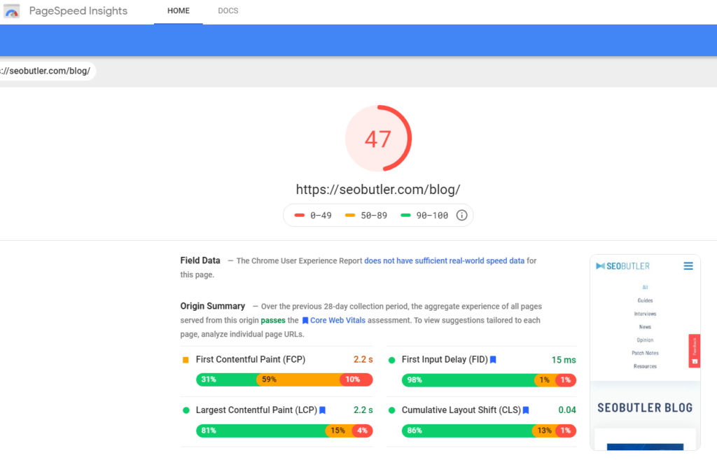
Page Speed
While page speed itself isn’t a direct ranking signal for Google, how users respond to a website due to the following factors is.
Aim to meet or exceed these baselines:
- Page Size < 800KB
- Fully loaded time < 2.4 Seconds
- 40 total requests or less
- 400 ms response time from the server or less
You can test your page speed for free at Google Page Speed Insights.
Note: the above metrics apply to 80% of websites and niches. They don’t apply to ecommerce websites and other niche properties.
Permalink / URL
From a technical perspective, Google wants your URLs to be informative, concise, easily comprehensible, and most importantly, shallow.
They have a lot of sites to crawl.
For example:
Don’t do: https://viictorymedia.com/tucson/services/SEO/
Or: https://viictorymedia.com/tucson/SEO
But rather: https://viictorymedia.com/tucson-SEO-services/
This structure allows Google to have a crawl depth that hops less between directories.
Users also prefer this structure because what the page is about can be easily discerned from the URL.
 (Source: Medium)
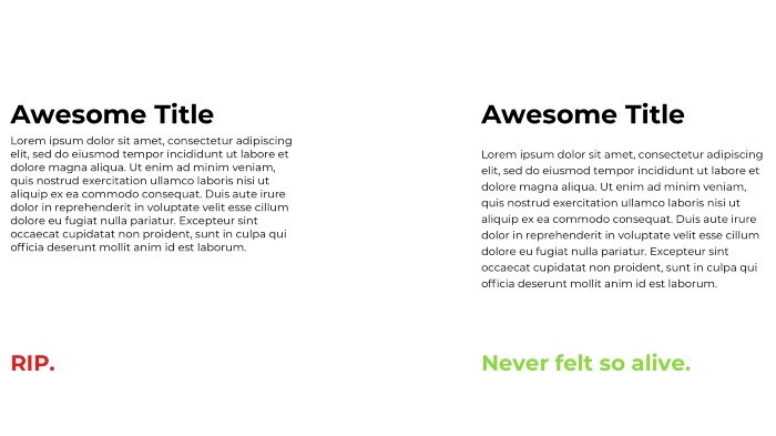
White Space
There are many opposing viewpoints about white-space and how much real estate it should take up on a website, but one fact stands out…
White space helps direct the user’s focus.
It also makes it easier to achieve a desirable contrast ratio.
Additionally, many believe a white background makes visitors more receptive to the information being presented on the page in comparison to darker colors.
 (Source: Contrast Ratio)
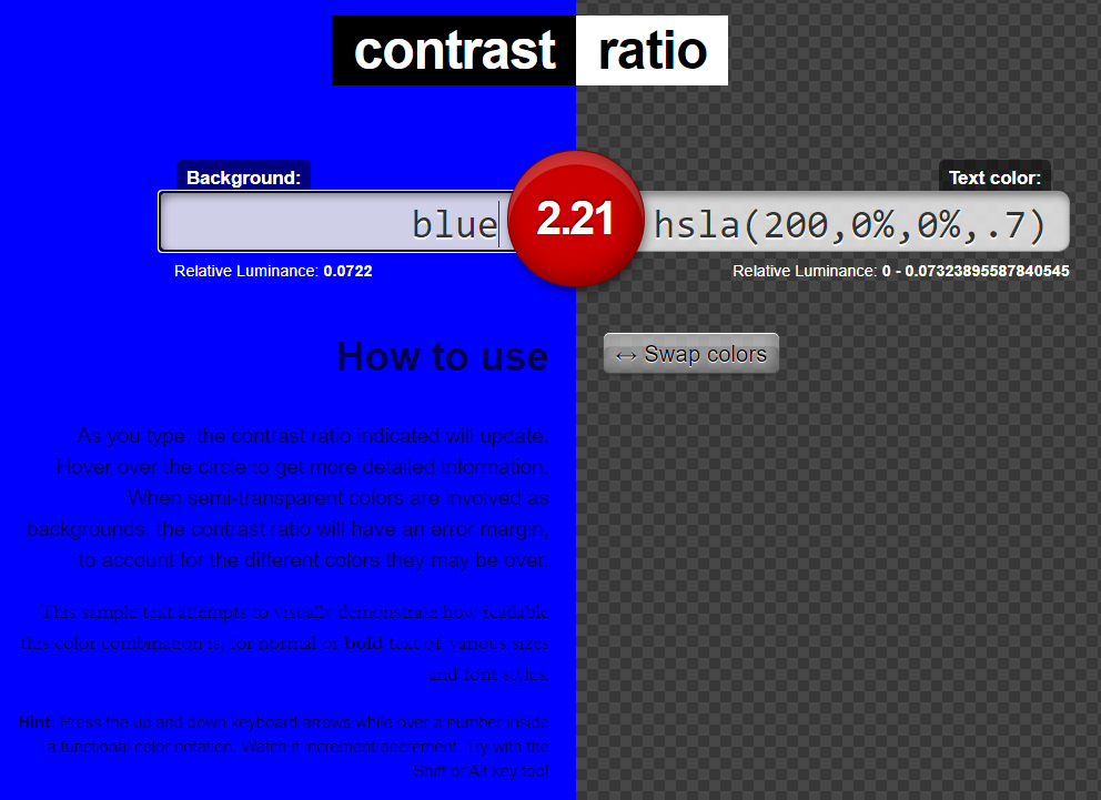
Contrast Ratio
The technical requirement for contrast ratio is 4:1. This ratio should always be used as a starting point for web design.
As ADA (Americans with Disabilities Act) guidelines become more important, search engines will continue to reward websites that implement them fully.
Tip: Test the contrast ratio of your design for free.
 (Source: Smashing Magazine)
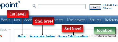
Bread Crumbs
Cascading down the page, the next technical recommendation we come to is bread crumbs.
Bread crumbs are primarily seen as an interlinking structure between pages on your site and also help visitors who may end up “lost.”
While bread crumbs aren’t absolutely necessary, they do give users and crawlers a better understanding of how your pages are linked and their hierarchy.
 Content Body
 Content Body
Moving on to the body of the content, we’ve highlighted a few overlooked yet crucial areas that should help your website be seen more favorably by Google.
 (Source: W3-Lab)
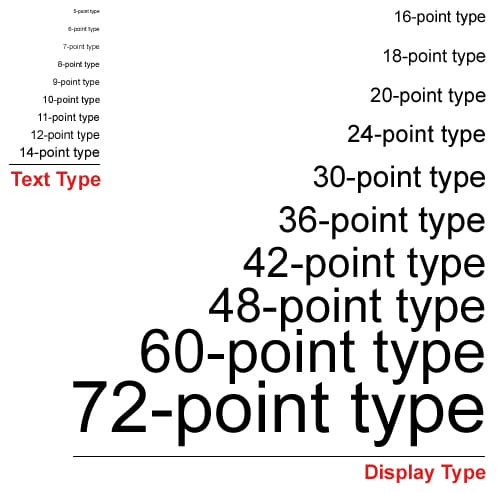
Font Size
While Google guides recommend using 16px fonts, we take this a step further and advise to consider the age demographic of your target market and the medium.
- 16px font or equivalent for ages 18 – 35
- 18px font or equivalent for ages 35 – 55
- 20px font or equivalent for ages 55+
- 16px font or equivalent for mostly desktop
- 18px font or equivalent for mobile
 (Source: SEOptimer)
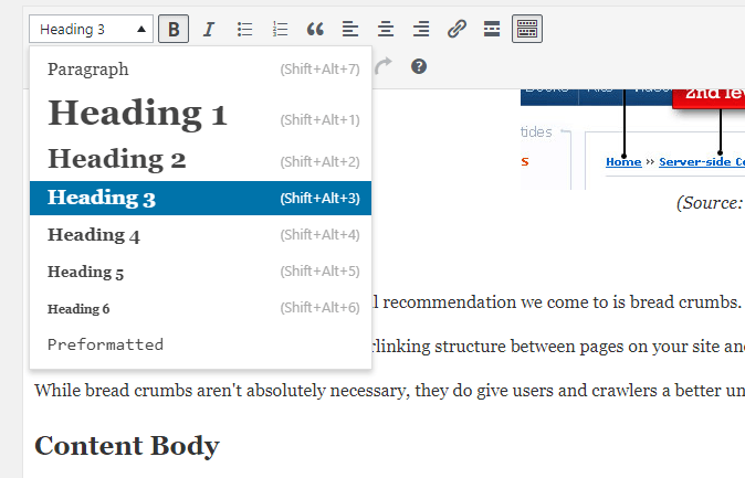
Headings
H1 – H6 headings should be used in the proper order.
Semantically, your H1 should also be the first line of text so that crawlers and humans can understand what the topic is at first glance or crawl.
Note: When creating headings do not use them to fulfill a stylistic need.
We often find that SEOs use headings for things like “Our Services”or “About Us”.
Using headings for visual formatting purposes inevitably detracts from your page’s topical relevance.
Primary Keywords
Primary keywords should appear naturally throughout your text and not condensed in any one area.
As crawlers cascade the page top to bottom, it’s essential to include the keyword ‘naturally’ throughout the body of the entire page, article or blog.
When trying to determine the ideal keyword density, find the average density of the top three websites you’re competing with.
You can do this by searching your keyword on each page, counting the total number in each document, and then dividing it by the number of websites used in your sample.
Proximal Words
When constructing your content, make sure to use positive adjectives in close proximity to your keywords to reinforce sentiment value.
Example: If your keyword is Tucson Web Design, proximal words that enforce sentiment value could be: best, expert, professional, or honest.
In essence, sentiment analysis helps provide search engines with a subjective understanding of your keywords and surface better results to search queries.
 (Source: James Madison University)
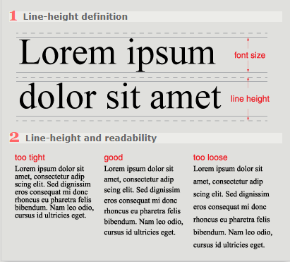
Line-Height
Your line-height should be 150% of the font size.
Thus, we can calculate that 150% or 1.5 to 1-7.
Following this guideline also improves readability and comprehension.
 (Source: Babich)
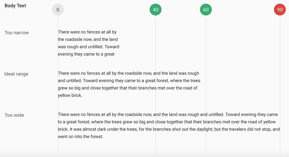
Line Length
Multiple studies show that a line length of 9 – 12 words (+/- 60 characters) helps readers feel less overwhelmed by walls of text, which in turn increases their dwell time.
Line Breaks
SEOs have known for a while now that breaking up lines of text increases dwell time.
Walls of text push readers away from your pages and content.
 (Source: UXMovement)
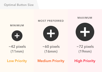
Button Size
Button size matters, especially on mobile devices and screens.
If a visitor can’t hit the tap target or it’s too small, Google may penalize your website for poor usability.
To prevent this, always make sure your buttons are a line-height of at least 56px or the equivalent.
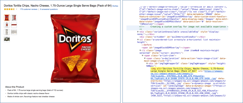
Pictures
Your pictures should be sized to the correct proportions of the div container and not appear bigger or smaller than the designated width.
Export images as a JPEG at the lowest possible resolution that preserves the necessary quality.
Include keywords in the naming conventions for your pictures if relevant — with an alt tag to match.
Note: The Save for Web command in Photoshop can help with this.
 (Source: Moz)
Alt Tags/Text
The alt in alt tags is short for “alternative.”
Alt tags are used to describe in words the appearance or function of images to a user unable to see them.
Ideally, alt tags should be full sentences, without hyphens, underscores or special characters, as they’re primarily intended for screen readers.
Div Classes & IDs
If you’re creating div classes and ids, they should contain helpful information regarding the table’s content.
For example, if you’re creating a table with a list of the top ten casinos, our advice is to name the table:
<div class=”top-ten-casino-list”>
This helps crawlers better understand what information you’re providing and how it relates to your website as a whole.
Internal Links
Each document, page, blog or article should include at least one link to other relevant content on your own website.
In many instances, you’ll want to link to additional authoritative content with anchor text that uses the keywords established in the H1 of the page you’re linking out to.
Outbound Links
Linking to content on external websites establishes a one-way link that helps Google understand what your content is similar to, or that it’s verifiable and authoritative.
Outbound links are crucial for content in the YMYL niche.
 (Source: AlsoAsked)
People Also Ask
Adding a “people also ask” section to the bottom of your pages allows you to link to other pages on your website related to similar topics.
For example, if your article is about The Future of Web Design, and you know that people are also asking about The Future of SEO, you can create a People Also Ask section with a brief description of the second topic. Briefly answer the question and link to the long-form content elsewhere on your website.
Tip: You can find out what “people also ask” about your topic by looking in the Google SERP for your query or by using AlsoAsked.
Author Biography
Author biographies help build trust and credibility in your content and brand — both from users who actively follow you and in the eyes of Google’s search algorithm.
Note: Google has begun to associate people’s names (entities) with other entities. For example, if you Google me (Schieler Mew) and head over to images, you’ll see the search engine has related me as a personal entity to SEO and Web Design, among other things.
Author’s Note: All information in this guide is derived from multiple meta-analyses, and Google directly. These guidelines aren’t hard and fast, but time and time again, they’ve been shown to increase optimization for search in multiple case studies.
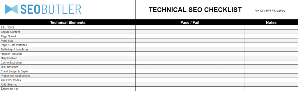
DOWNLOAD THE TECHNICAL SEO CHECKLIST!
References:
https://design.google/resources/
https://developers.google.com/style
https://support.google.com/webmasters/answer/7451184?hl=en
https://uxdesign.cc/building-a-design-system-where-to-start-part-4-typography-5065b8d360c
https://medium.com/successivetech/importance-of-whitespace-in-good-design-de03ea0ab4db
https://material.io/design/usability/accessibility.html
[cta]
[author_bio image=”https://seobutler.com/wp-content/uploads/2019/07/Schieler-Mew-Headshot-Cropped-150×150.png” name=”SCHIELER MEW”]Schieler Mew is a Digital Marketing Strategist and Comprehensive SEO consultant that has worked with Fortune 500 companies all the way down to local SMB’s. He specializes in advanced SEO theory and technical concepts to help online businesses thrive in evolving and volatile markets. Schieler is the owner of Viictory Media[/author_bio]
3 thoughts on “The On-Page SEO Guide For Technical Processes”
Leave a Reply
You must be logged in to post a comment.
really nice post. useful information
Thanks for this. Very helpful guide for neophyte like me. 🙂
Nice post and very helpful!