Analyze Your Content Like a Detective: A HotJar Guide

Disclaimer: Sam and I are in no way affiliated with HotJar, pushing affiliate links, or subversively trying to get you to buy any products.
It’s just a great tool for content creators – if they know how to use it.
And that’s what this guide is about.
If you find this helpful – let me know what has confused or frustrated you in the past about content analytics, A/B testing, or reporting.
Introduction
I recently interviewed Sam Werbalowsky, who has eight years of marketing analytics experience.
We loaded up HotJar on my site to get a better sense of user behavior – and what we can actually do with these insights.
A lot of the content creators I speak with have trouble grokking what to do with data.
It’s kind of just… there.
The numbers go up and down, they’re used in reports, but what can you do with user data to make your site better, sell more stuff?
That’s where HotJar comes in.
For a recently-launched website like mine, it can be invaluable – it has a free forever tier, and I prefer the UI over Fullstory’s.
TL;DR
Here are the key takeaways, which I’ll be diving into:
- HotJar lets you look at user heatmaps and screen recordings, and has features like polls that help you better segment and understand your site visitors.
- Scroll heatmaps show the average fold — that’s where the screen cuts off for most visitors when they land on your site. That cutoff might be the middle of a paragraph or image — which can be a good thing as most users want to scroll down and see more.
- Click heatmaps show where users click the most. You should look for discrepancies between click heatmaps and movement heatmaps. If users are lingering around a button but not clicking it, the description or visuals may not align with the CTA.
- Screen recordings are useful for taking a granular look at an individual’s behavior, but even with dozens of visitors, viewing all these recordings could become overwhelming.
- Using HotJar’s polls, you can segment your audience and take a look at that segment’s screen recordings.
- Content analytics is NOT looking at dashboards – it’s a detective game where you piece together clues until you have a clearer picture of how humans interact with your site.
What does HotJar do?
HotJar does a few different things.
We’ll be going over heatmaps and screen recordings, and touch on the polls feature.
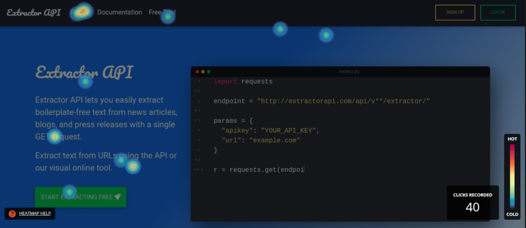
Heatmaps are great for demonstrating how a bunch of users are interacting with your site.
They show you “hot” and “cold” areas.
We’ll explain exactly what that means in a bit.
They look like this:
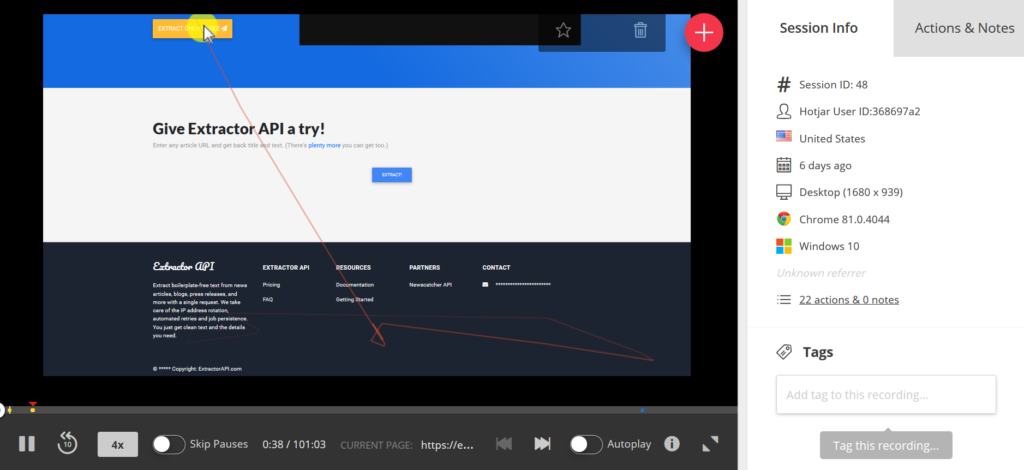
 Screen recordings show how your users navigate through your site.
They’re great for going in-depth on how a subset of users behaves.
 If you’ve ever thought the term “segmentation” was a bit nebulous, we’ll show you exactly how you can use HotJar’s tools to identify the types of people coming to your site — it’s easier than you think.
Taking a Look at Heatmaps
HotJar has three types of heatmaps: scroll heatmaps, click heatmaps, and movement heatmaps.
They’re all useful in their own way.
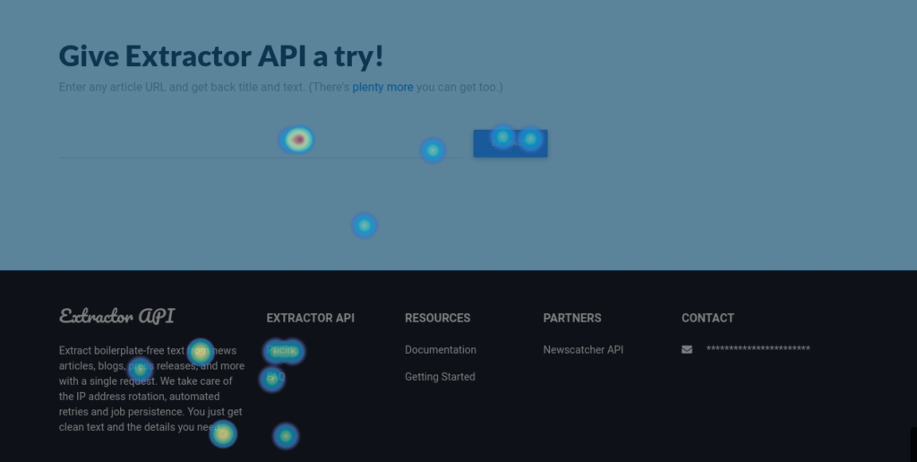
Scroll Heatmap
We’re looking at user scroll data first because it gives you a nice overview of what most of your users will see on your website.
As content people (and really, anyone working on a website), we sometimes forget that the world literally sees our content differently — whether they’re on mobile, have a weird monitor resolution, or have resized their browser.
A scroll heatmap allows us to see what the majority of users see when they land on our site.
Here’s what it looks like:
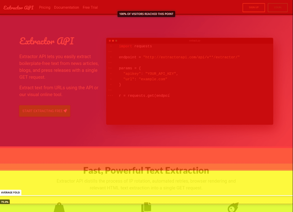 If you’re going to look at just one thing in this section, it’s the average fold.
Unless the user has turned their monitor vertically like Gilfoyle from Silicon Valley…
 (Source: SDTimes)
… they’ll likely see a cutoff – called the “average fold.”
And we see above that this is right below the Fast, Powerful Text Extraction header, and the description underneath.
In most cases, you want the average fold to be in a place that hints to the user that there’s more content coming.
This makes people want to scroll down and see that missing content.
In my case, the ideal fold would be somewhere in the middle of the icons.
Here’s a pic of an older heatmap:
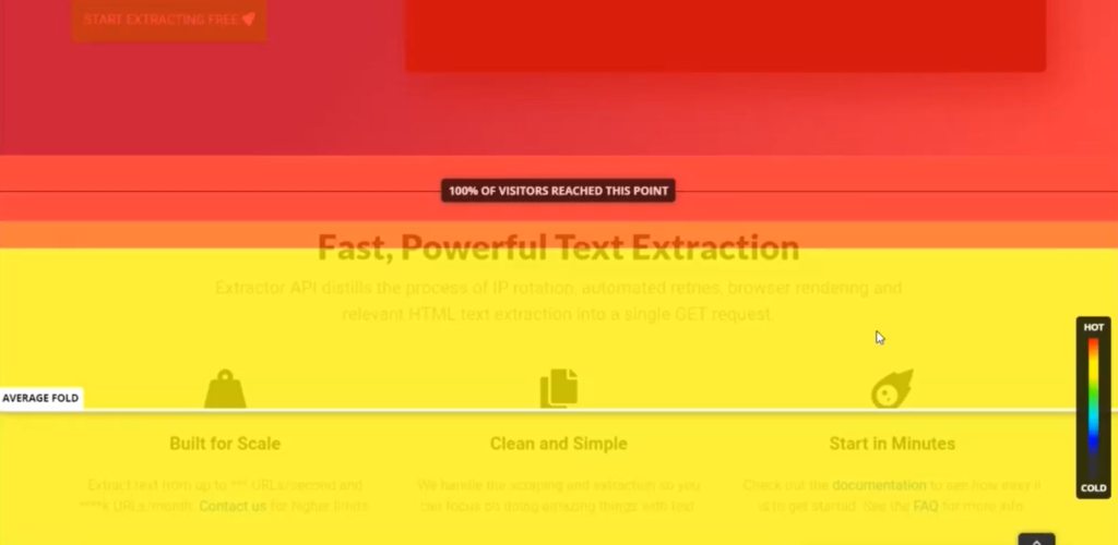 This way, users know there’s more content below, and are likely to scroll down and see what’s below the cutoff icons.
Sometimes, neater isn’t better.
A good A/B testing opportunity here would be to cut some of the space between my header section and the feature section, and use the other heatmaps to see if people interact more with the rest of the homepage.
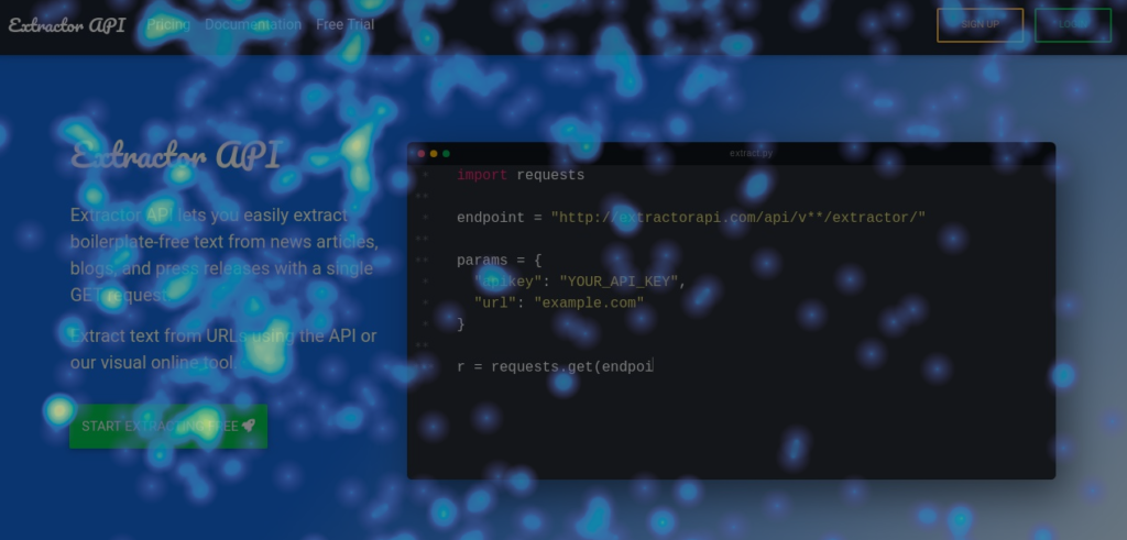
Click Heatmap
Remember when we spoke about “hot” and “cold”?
Click heatmaps have “hot” areas where people click more, and “cold” areas where they click less.
 The first question I had for Sam was, why are people clicking on text that goes absolutely nowhere?
There are a few explanations for this.
Sometimes, people just think things are clickable, but mostly people click and highlight text they’re reading and trying to understand.
That could mean they’re really interested and are trying to get as much information as possible, or they’re confused and re-reading something they’re not sure about.
(We can support this hypothesis by looking at the movement heatmap in a bit.)
Text that’s not linked, but which people are still clicking — as you see in the description in the footer above — presents us with an opportunity.
We can link that text to a page that goes into more detail on the subject.
For example, above, I describe what my API does.
If people are clicking around that area, maybe they’d like more information about its capabilities.
I could link to a FAQ page, or put a link to one in my main menu.
Of course, this is just a hypothesis.
You can A/B test this to confirm it.
I suggest using Google Optimize, which is a free A/B testing tool – you can find a video guide on setting up Optimize for your site here.
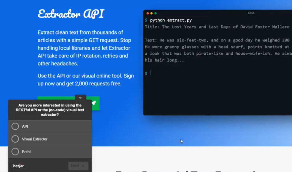
Movement Heatmap
The last heatmap we’ll look at is the movement heatmaps – no clicks, just mouse movements.
Here’s what it looks like:
 That doesn’t exactly look helpful…
But movement is just a piece of the puzzle: we’re looking for discrepancies between the click heatmap and the movement heatmap.
Here’s the click heatmap again:
See the difference between how people move their mouse near the main call to action (the green button) and the number of clicks the CTA actually gets?
That’s a problem.
If people are hovering around your CTA a lot, but not clicking it, that means they’re unsure of where the button leads, the copy isn’t strong enough, or the description doesn’t give enough information about the product or service.
Let’s also look at the movement around the footer of my site.
Remember I wrote above that clicks on plain text could mean confusion or interest?
Take a look at this:
 This is a good sign.
People aren’t really lingering on the description — more so on the link to the FAQ page on the right.
Let’s jump into screen recordings to take a more granular look at user behavior.
Screen Recordings
Screen recordings are recordings of a user’s session on your site – minus any identifiable information.
Here’s what Sam’s session on my site looks like (he’s the only user that spent over an hour on the website ?):
Warning, soapbox time…
Here’s where more of the pieces fall into place.
Because analytics isn’t just reports or graphs: it’s a detective game.
And as content creators, we’re used to doing tons of research, so this is good news.
We’re good at piecing together concepts, making them easier to grok…
We know this game.
It’s just that we don’t have the rules laid out very well.
Think of these pieces – heatmaps, recordings, site analytics reports, A/B test results – as evidence.
You’re collecting this evidence to get a better picture of how users behave on your site.
All these pieces are interconnected, so you need each one to see the whole picture.
If that sounds complicated, it isn’t.
The more you look at the piece, the more you’ll see a picture emerging.
Ever tried to look at just a corner of a Magic Eye stereogram?
OK, rant over…
Let’s take a look at that pic again:
So there are only a few things that we have to look at here.
Each recording traces mouse movements and clicks.
It lets you see if visitors are confused about a section (whether they’re lingering on it or continually going back to re-read something).
Of course, you can watch the playback for each visitor and confirm the hypotheses you made by looking at the heatmaps.
But that will take forever as your site grows — Sam showed me an easier way to do this with HotJar’s polls.
Implementing Polls
There’s a bunch of ways to filter screen recordings to narrow things down in your investigation, but Sam showed me a great method that implements HotJar’s polls.
I created a simple poll asking users whether they want to use the API, the visual component, or both.
On the site, it looks this:
What’s great about this is that it helps segment your audience.
You can then filter your audience by those who selected a particular choice and watch their recorded sessions.
Eventually I may get a majority of visitors saying they’d prefer the visual component of my product.
I could then take a look at how they’re individually interacting with the site.
Conclusion
I hope that gave you a better idea of how you can piece individual pieces of data together into a clearer picture of what users think about your site.
The biggest piece of advice I can give — don’t over-rely on dashboards.
Seriously, stay far away from them if you’re trying to get a nuanced perspective of user activity.
A few key metrics don’t exactly paint a picture — check out The Law of Shitty Clickthroughs for a more in-depth look at this.
Write any questions and feedback below — eager to hear what you all think, the methods you use, things that have helped you grok stats during your career, etc.
I’ll ask Sam to answer any questions you might have as well.
[cta]
[author_bio image=”https://seobutler.com/wp-content/uploads/2020/05/Aleks-Smechov-Headshot.png” name=”ALEKS SMECHOV”]Aleks has been copywriting for the better part of a decade. Three years ago, he began exploring analytics and programming, and has since been on a mission to bridge the gap between creative copy and cold hard data. He’s the co-founder at extractorapi.com.
[/author_bio]